Lena Kaapke: Selected works, 2012-2022
Atmographics, 2022
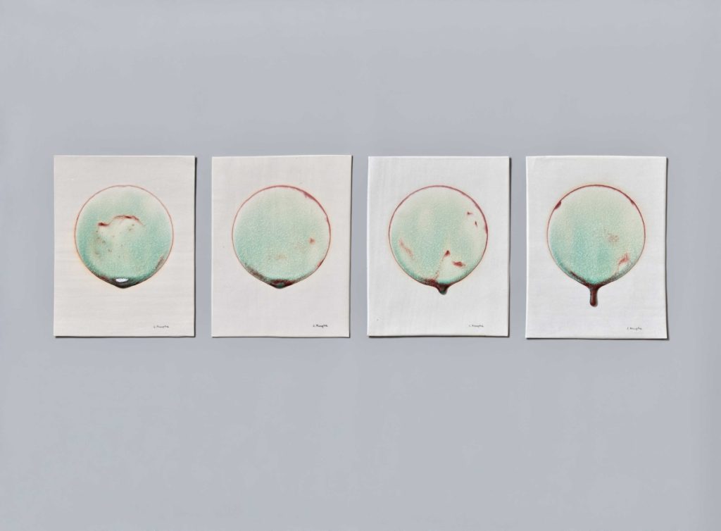
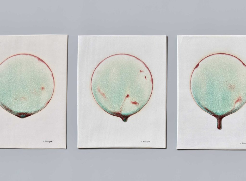
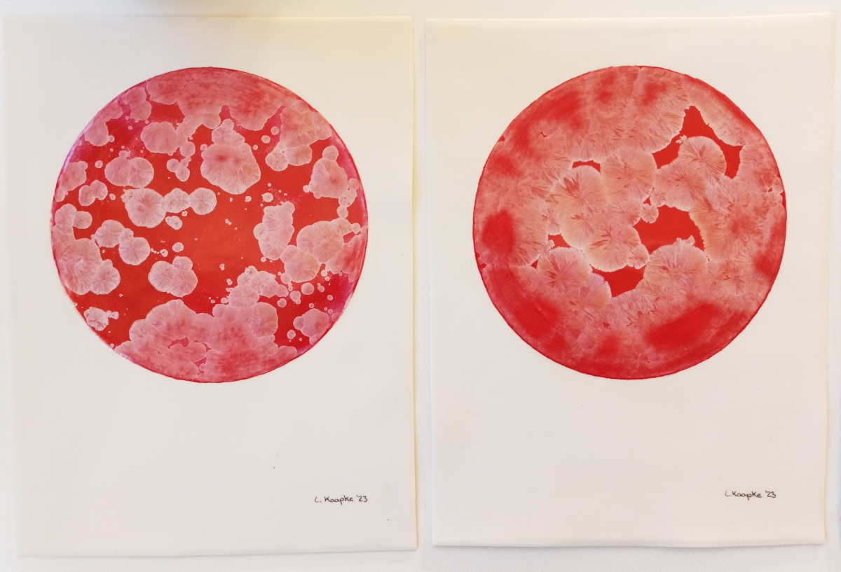
Atmographics are ceramic graphics. The project explores the graphic potential of one single glaze that is from the chemical perspective always the same. Through controlled changes in the firing process, ceramic color is used purposefully graphically.
I am interested in how the aesthetic expressive potential of a single ceramic color can be enhanced by the possibilities of technologies. Pure technology reveals the painterly nature of the ceramic discipline. Thus, the atmographics show the past atmosphere and preserve it permanently in images of ceramic and ceramic color.
Atmographics – 15°/30°/45°/60°, 2022, installation, porcelain and glaze, 37 x 120 cm, photos by Helmut Kunde / Atmographics, 2023, ceramic graphics, porcelain and glaze, each 37 x 27 cm, photos by Lena Kaapke
Water for Drinking, 2021
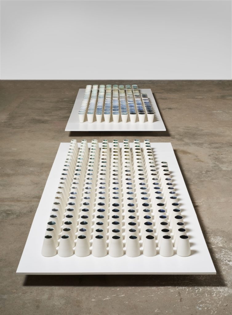
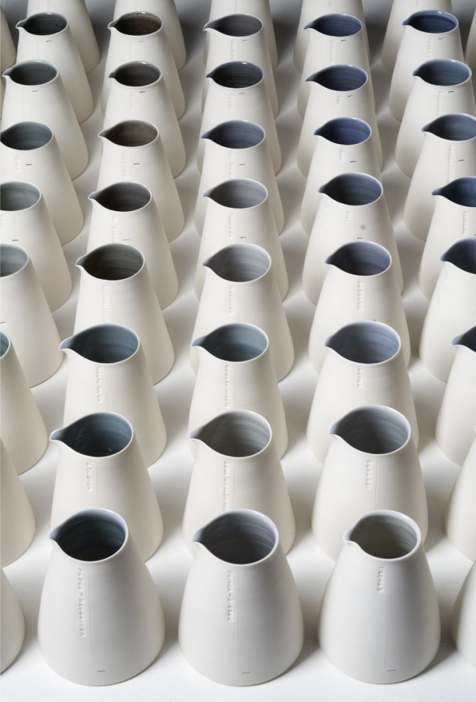
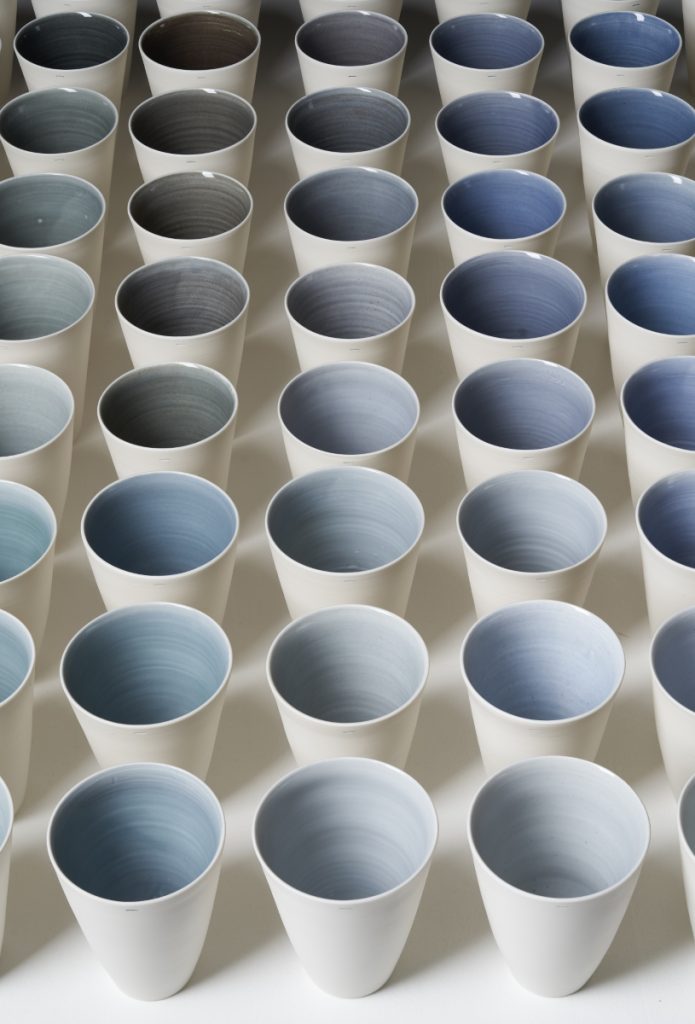
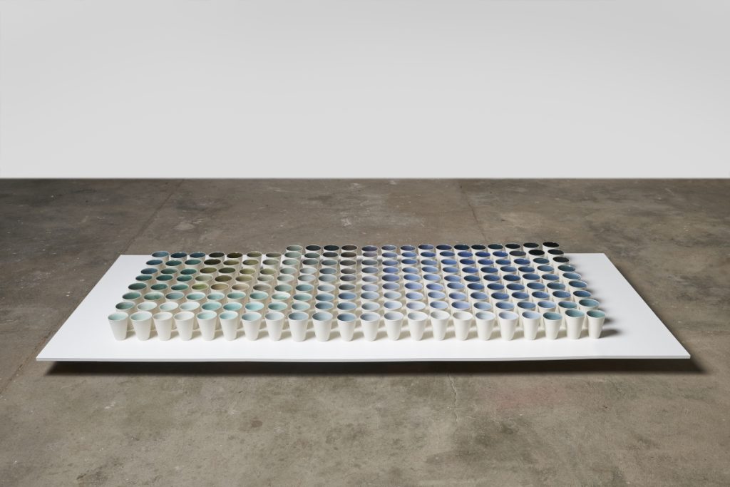
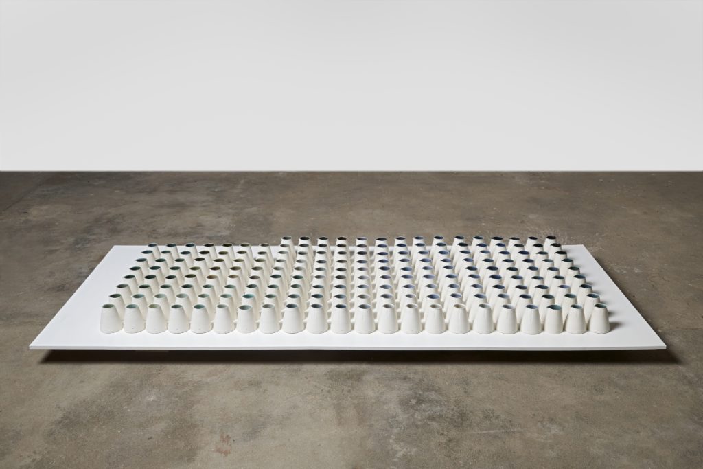
194 hand-thrown jars and 194 hand-thrown drinking vessels represent each a nation-state of the Earth.
Each jug has an embossed scale and a colored line that marks the limit of the associated fill volume. The size of the jug symbolizes the ideally available amount of clean and accessible drinking water needed to provide sufficient drinking water to all the inhabitants of the country. An embossed country name assigns the respective water level in each jug to a specific country. The fill volume symbolized by the line shows the percentage of inhabitants who actually have access to drinking water.
The size of the drinking container represents the real drinking water needs of all the inhabitants of the country concerned and also the drinking water needs of all the inhabitants of the world.
Each of the 194 jar container pairs is assigned a different ceramic watercolor. The blue-grey-green tones are the result of research into different, naturally collected watercolors and imitating these colors in the glaze. The more drinking water there is in a country, the darker the color of the water is, the less drinking water there is, the brighter the color is.
The 194 jars are arranged in the installation. In addition, the 194 drinking containers are arranged. The two sets of arrangements face each other and are separated at the same time. The potential of the need to provide drinking water to the inhabitants of this planet is at odds with reality. Need and possession set a contrast, wrestle with each other and at the same time form an aesthetic unit.
Water for Drinking, 2021, installation, porcelain and glaze, 120 x 700 x 50cm, photo by Helmut Kunde
Red I, 2015
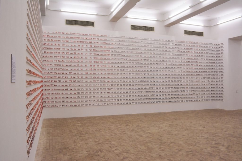
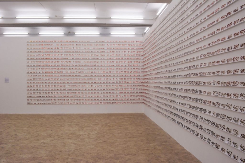
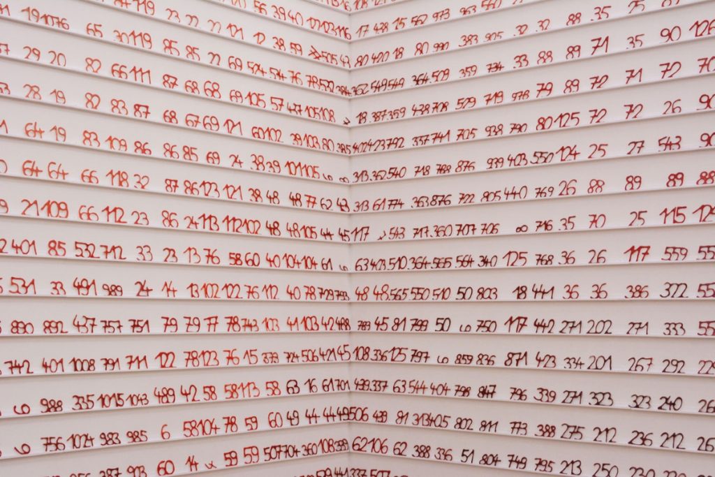
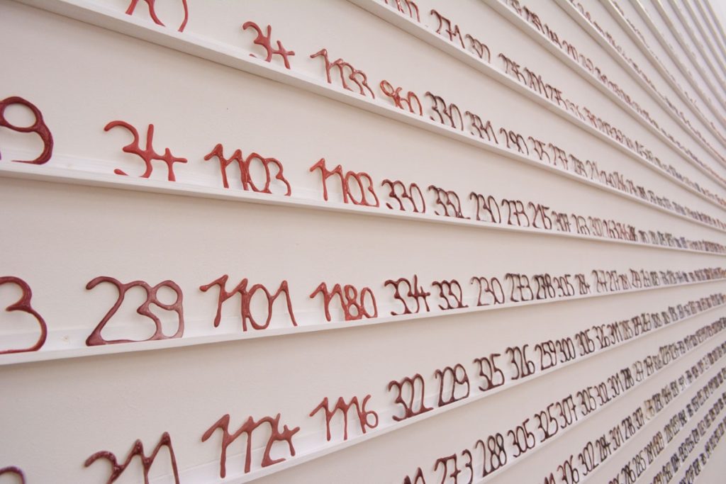
My installation Red I reports on my art research. It’s about ceramics itself, about ceramic color.
In my work Red I, I use scientific investigation from my research project “the color red in ceramic technologies” as a material to make art. Each of my red recipes is represented by a handwritten number made of porcelain fired with the appropriate ceramic surface. Numbers can occur more frequently, since different firing programmes, different firing curves, as well as different coating densities can lead to different reds despite the same recipe. Thus, a number always shows the variation of a recipe. The numbers reflect the order of my glaze production and my glaze research.
In this way, the work reflects how ceramic color works and at the same time uses all the results of the scientific research. The installation Red I in a representative selection out of a total of 7,000 different red shades and tones shows the ceramic spectrum of red I have found. It is my research report.
Red I, since 2015, installation, porcelain and glaze, 300 x 1900 cm, photo by Lena Kaapke
Fieldinvestigation by foot, 2012
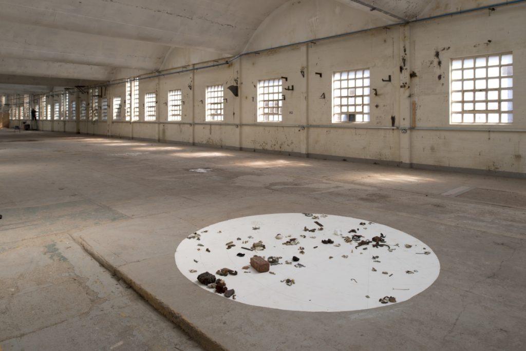
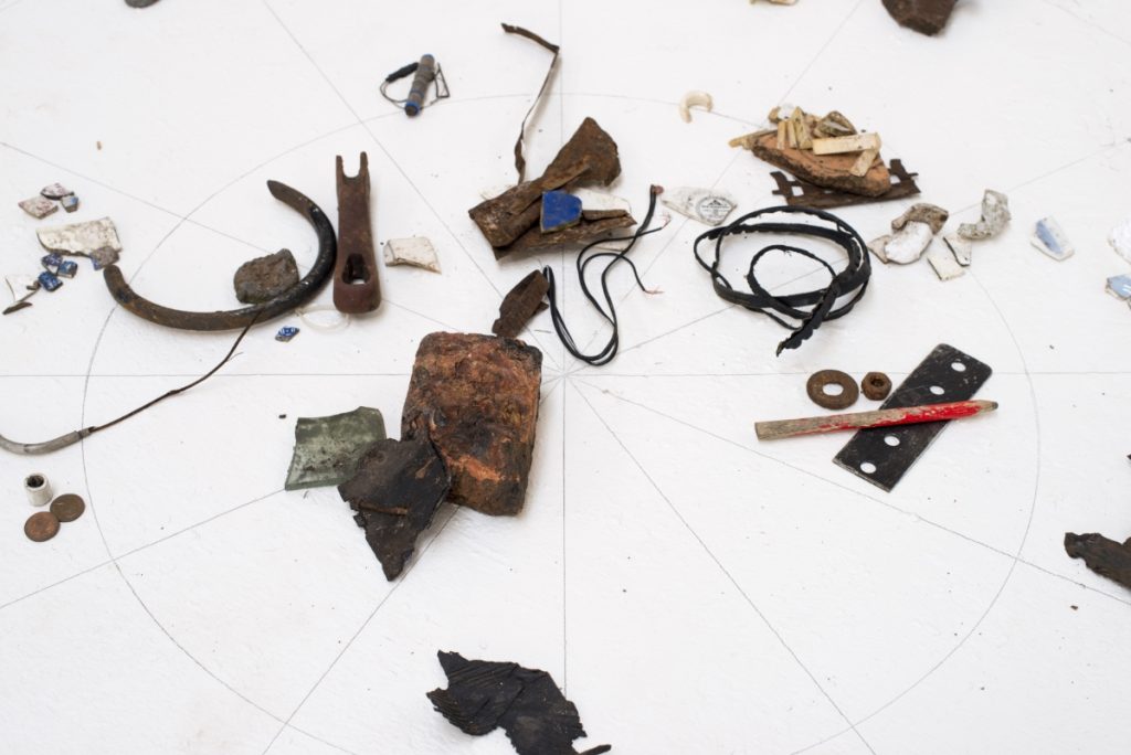
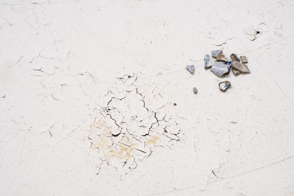
This project deals with topography.
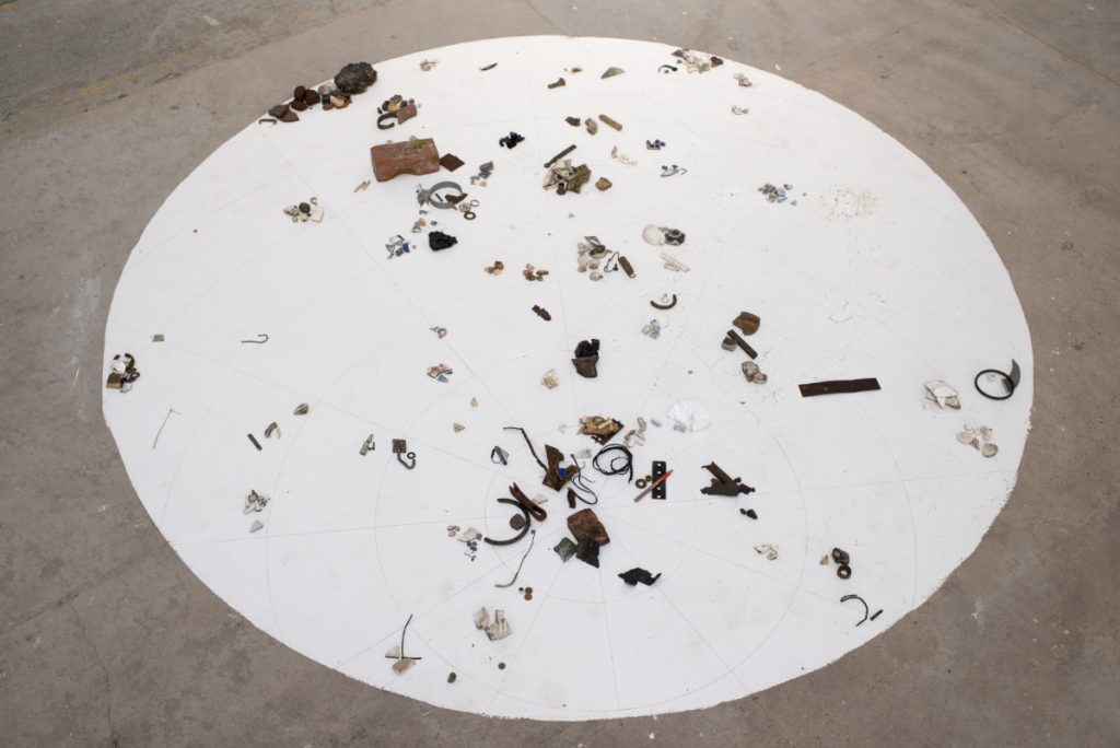
I worked outside. Within a circle of ten kilometers, I wandered through Stoke-on-Trent and collected things. By collecting, I wanted to get to know Stoke on Trent and open it up. What did I collect? I collected everything which in my eyes has to do with factories. Things that interested me, which I automatically wanted to pick up. If I had to think about whether I wanted to take an object with me or not, I left it behind.
I dumped the finds in the factory in the evening in an order system that was transferred to the mapping system while I was out and about. The objects were ordered according to locality. I arranged the finds in the same circle in the factory, which also corresponded to my search radius, the circle on my map. The factory was located where the lines intersected. Each circular line corresponded to one kilometer.
The primer is made of China clay and paste. It represents the historical reason for my work and is a real basis for my new topography. By working in this way, I describe, survey, and redraw the city of Stoke on Trent and do topography in the literal sense (τόπος “place” und γράφω “write/draw”). Topography also means sketching a place, not just writing about it. By creating a new typography, I show what still remains today. The “obsolete” is reflected in the former significance of the location as an industrial center widely known for European ceramic development.
Fieldinvestigation by foot, 2012, installation, relicts, porcelain slip and hand-drawing, 300 x 300 cm, photo by Bjarte Bjørkum




AWESOME I would travel a great distance to see Lena Kaapke’s work. Many thanks to Ceramic Now